Response Curve
What is Response Curve
A response curve is a graphical representation of the relationship between inputs and outputs in a system or process. It is typically plotted on a two-dimensional graph, with the input variable on the horizontal (x-axis) and the output variable on the vertical (y-axis). The input variable can be any measurable parameter, such as frequency, time, voltage, or temperature, while the output variable can be any parameter that is affected by the input, such as amplitude, phase, power, or resistance.
In many fields, response curves are used to analyze and optimize the performance of systems or processes. For example, in audio engineering, a speaker’s frequency response curve shows its output level variation with different sound frequencies. By analyzing this curve, engineers can determine the speaker’s frequency range, sensitivity, distortion characteristics, and make design adjustments as needed. Similarly, in electronics, response curves can be used to analyze the performance of circuits or devices: for instance, a transistor’s current-voltage (I-V) curve shows how its output current varies with input voltage. By analyzing this curve, engineers can determine the transistor’s operating region, gain, linearity, and optimize its performance for different applications. Response curves can also be used to compare different systems or processes. For example, comparing the response curves of different audio speakers or electronic devices can help engineers choose the best option for a specific application.
In summary, response curves are an important tool for analyzing and optimizing the performance of systems and processes in many fields. By providing a graphical representation of the relationship between input and output variables, they help engineers and scientists understand the characteristics of a system or process and make informed decisions to improve them.
Draw Response Curve using REVIVE SDK
To draw response curves using the REVIVE SDK, there are two ways to do so:
1. Configure under the base_config field in the config.json file
In default, true is to turn on the response curve drawing, and false is to turn it off.
{
   "base_config": [
         ...
      {
            "name": "plt_response_curve",
            "abbreviation": "prc",
            "description": "Whether to plot response curve at the end of venv training.",
            "type": "bool",
            "default": true
      },
         ...
   ],
   ...
   }
}
REVIVE will automatically plot the response curves for both the training and validation environments when the virtual environmental training is complete.
The path to the response curves will be located at logs/<run_id>/venv_train/response_curve.
Using the example of refrigerator temperature control, the generated file directory structure would be as follows:
response_curve
|-- action
|   `-- action_on_temperature.png
`-- next_temperature
   |-- next_temperature_on_action.png
   |-- next_temperature_on_door_open.png
   `-- next_temperature_on_temperature.png
Each folder in this directory corresponds to a network node in the decision flow chart.
For example, in this case, action and next_temperature are network nodes and act as output variables.
Each folder contains multiple images, each representing the response curve of a different input variable to the corresponding output.
For instance, action_on_temperature.png represents the response curve of action with respect to temperature.
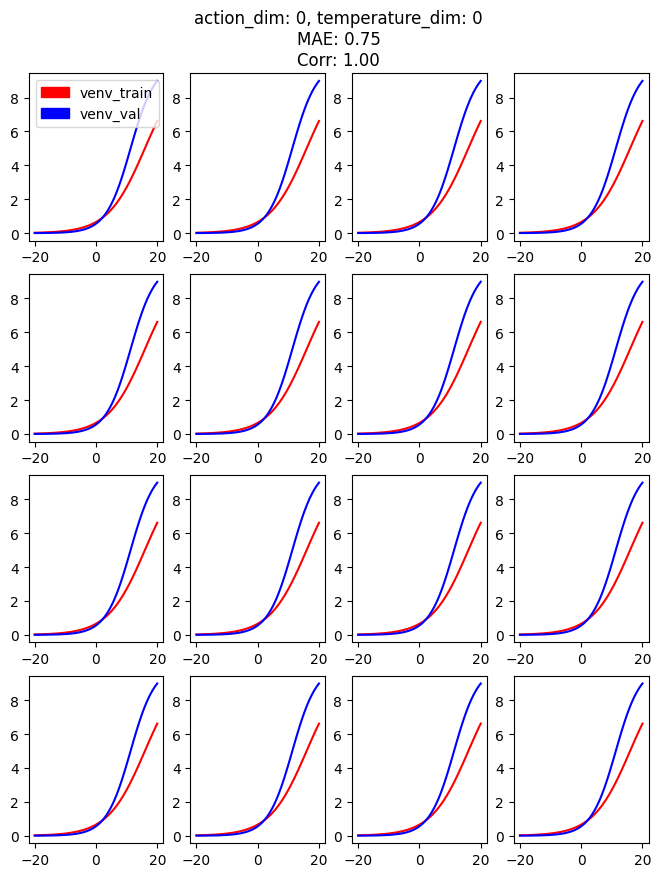
This response curve is shown below:

The figure shows 16 subplots, which are generated by randomly sampling 16 data points from the dataset.
The x-axis represents the range of temperature changes,
and the y-axis represents the trend of the dependent variable action.
The red line represents the predicted values in the training environment,
and the blue line represents the predicted values in the validation environment.
From the graph, we can see that as the temperature gradually increases,
the power consumption of the refrigerator motor (action) gradually increases,
stabilizing the temperature inside the refrigerator at around the target temperature of -2 degrees.
The trend of the training and validation environments is almost identical, indicating good consistency between the two environments.
We can also calculate the Mean Absolute Error (MAE) and Spearman Correlation coefficient between the two environments.
We can see this information in the title of each of the 16 subplots.
Note that the MAE and Correlation coefficient are calculated by averaging across the 16 subplots and each action variable.
For high-dimensional data, please refer to the following example:
2. Generate the response curve by calling the scripts provided by the REVIVE SDK.
import pickle
from revive.data.dataset import OfflineDataset
from revive.utils.common_utils import load_data, response_curve

if __name__ == "__main__":
   dataset_path = "data/halfcheetah-medium-v2.npz"  # replace it with corresponding dataset path
   yaml_path = "data/halfcheetah-medium-v2.yaml"  # replace it with corresponding .yaml path
   dataset = OfflineDataset(dataset_path, yaml_path).data

   venv = pickle.load(open("logs/revive/env.pkl", 'rb'), encoding='utf-8')  # replace it with corresponding venv path
   save_path = "./response"  # set saving path

   response_curve(save_path, venv, dataset)
Using HalfCheetah as an example, the generated file directory structure would be as follows:
response
|-- action
|   `-- action_on_obs.png
|-- delta_x
|   |-- delta_x_on_action.png
|   `-- delta_x_on_obs.png
`-- next_obs
   |-- next_obs_on_action.png
   |-- next_obs_on_delta_x.png
   `-- next_obs_on_obs.png
For instance, next_obs_on_action.png represents the response curve of next_obs with respect to action.
This response curve is shown below:

Below we explain in detail how the response curve is generated. Suppose our data is defined in the following form:
obs |
Continuous(17,) |
\(S^i = [s^i_0, s^i_1, ..., s^i_{16}]\) |
action |
Continuous(6,) |
\(A^i = [a^i_0, a^i_1, ..., a^i_5]\) |
next_obs |
Continuous(17,) |
\({NS}^i = [ns^i_0, ns^i_1, ..., ns^i_{16}]\) |
Firstly, we sample 16 data points from the dataset: \(<S^0, A^0, {NS}^0>, <S^1, A^1, {NS}^1>, ..., <S^{15}, A^{15}, {NS}^{15}>\).
For instance, in the subplot (next_obs_dim: t, action_dim: k),
there are 16 subplots that represent how we iterate over the range of values of \(a^i_k\) (i.e., [-1, 1]), the k-th element of \(A^i\), and observe the changes of \(ns^i_t\), the t-th element of \(NS^i\), while keeping \(S^i\) fixed.
In other words, we observe the response of \(ns^i_t\) with respect to \(a^i_k\) given \(S^i\).
Here, \(i \in [0, 15], t \in [0, 17], k \in [0, 5]\).